The work on the hallway floor is well underway and the underfloor heating and tiling should be done by the beginning of next week. If you follow me on Instagram you will have seen that I painted the walls Shaded White before the work began and that has made the space feel so much warmer to balance the cooler Incyhra Blue below the dado rail. The walls were previously a budget-saving Brilliant White, which I always knew I would change down the line once I got a good feeling for the space and had saved up again after the initial renovation budget was blown. I really disliked the Brilliant White after a while as it is so cool and actually makes a space that lacks natural lighting quite dingy; it is definitely not a good choice if you want to brighten or warm up a room. So, the combination of Inchyra Blue and Shaded White is a great one and extremely practical as the blue hides all sorts of scuffs and dirt at dog and child level. However, I want to add another colour to the hallway to make it more welcoming and cosy but one that will work well with the rest of the house and all of the greens and blues. Therefore, I want to add some deep reds here and there. The inspiration came from this DIY lamp that I spray painted a while ago and I just love the way that colour sits with the blues and greens downstairs and it really adds a touch of warmth and rich colour. I also have reds and rust colours in the rug in our home office and it adds so much to that space and even glimpses of it from the landing seems to wrap the whole first floor up in a lovely warm glow.
I’ve been noticing a lot of gorgeous red, rust and wine-coloured homewares and paint colours and I’ve decided to paint the inside of the front door Refectory Red, which is a deVOL furniture and joinery paint (hoping it works on our uPVC door as it’s been primed and painted with eggshell previously so it can be treated like interior wood now…famous last words) as well as adding a couple of other red touches with accessories. Obviously I wish it were a beautiful original 30s front door that I will be painting but it really doesn’t look plastic anymore and I hope the Refectory Red will add a big dose of cosiness to the space whilst still being dark enough not to highlight the ugly the ugly mouldings on the door.
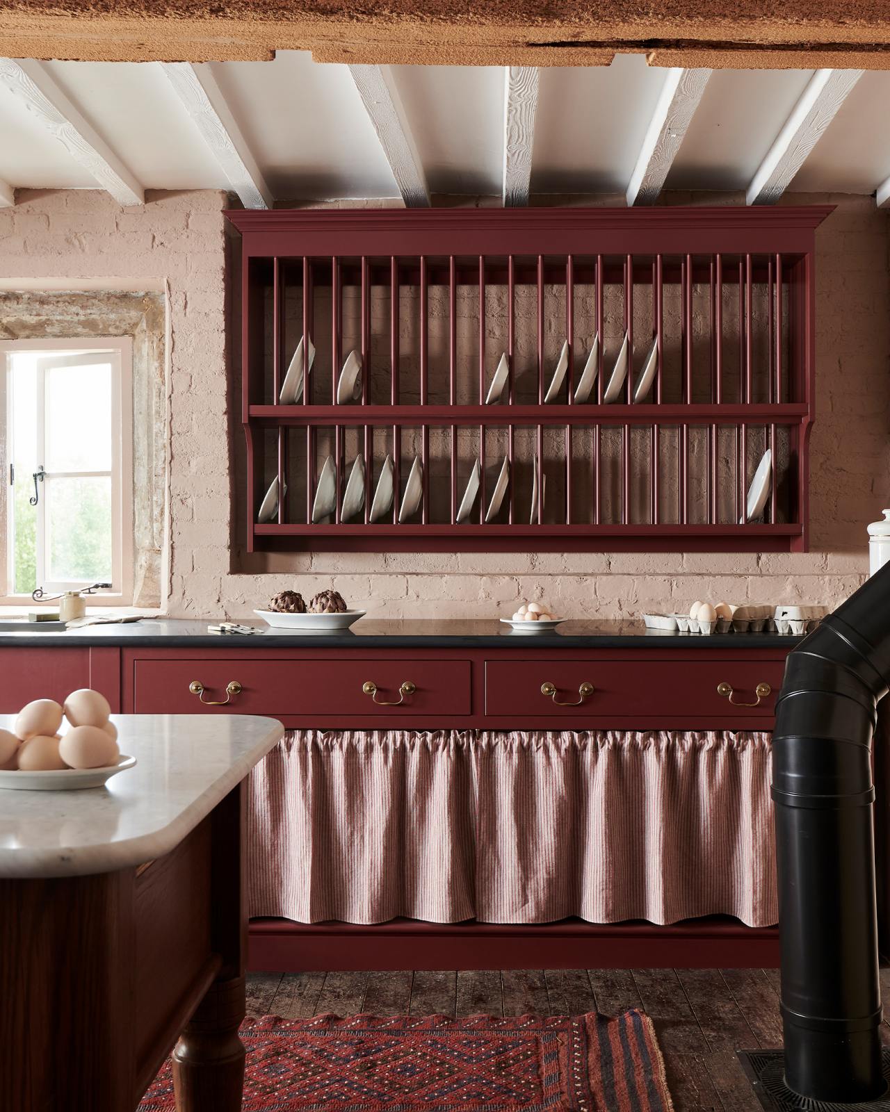
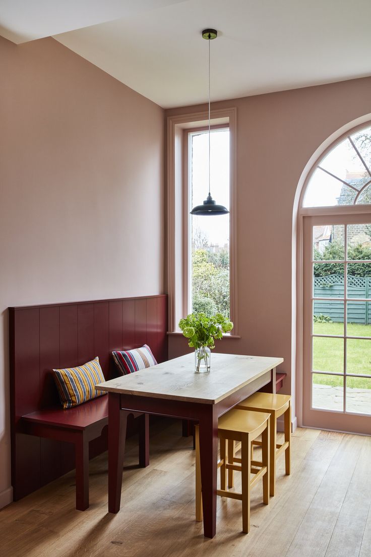
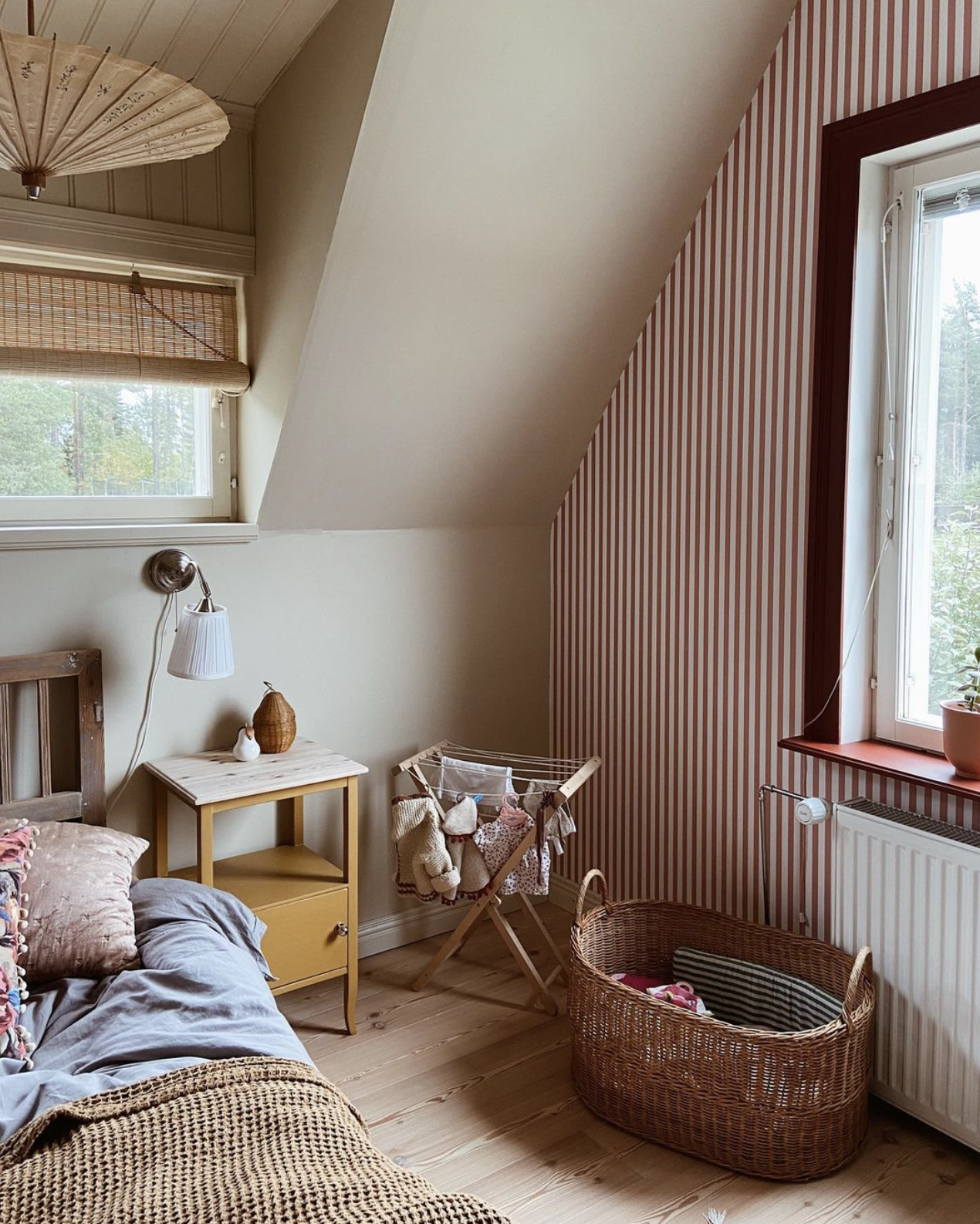
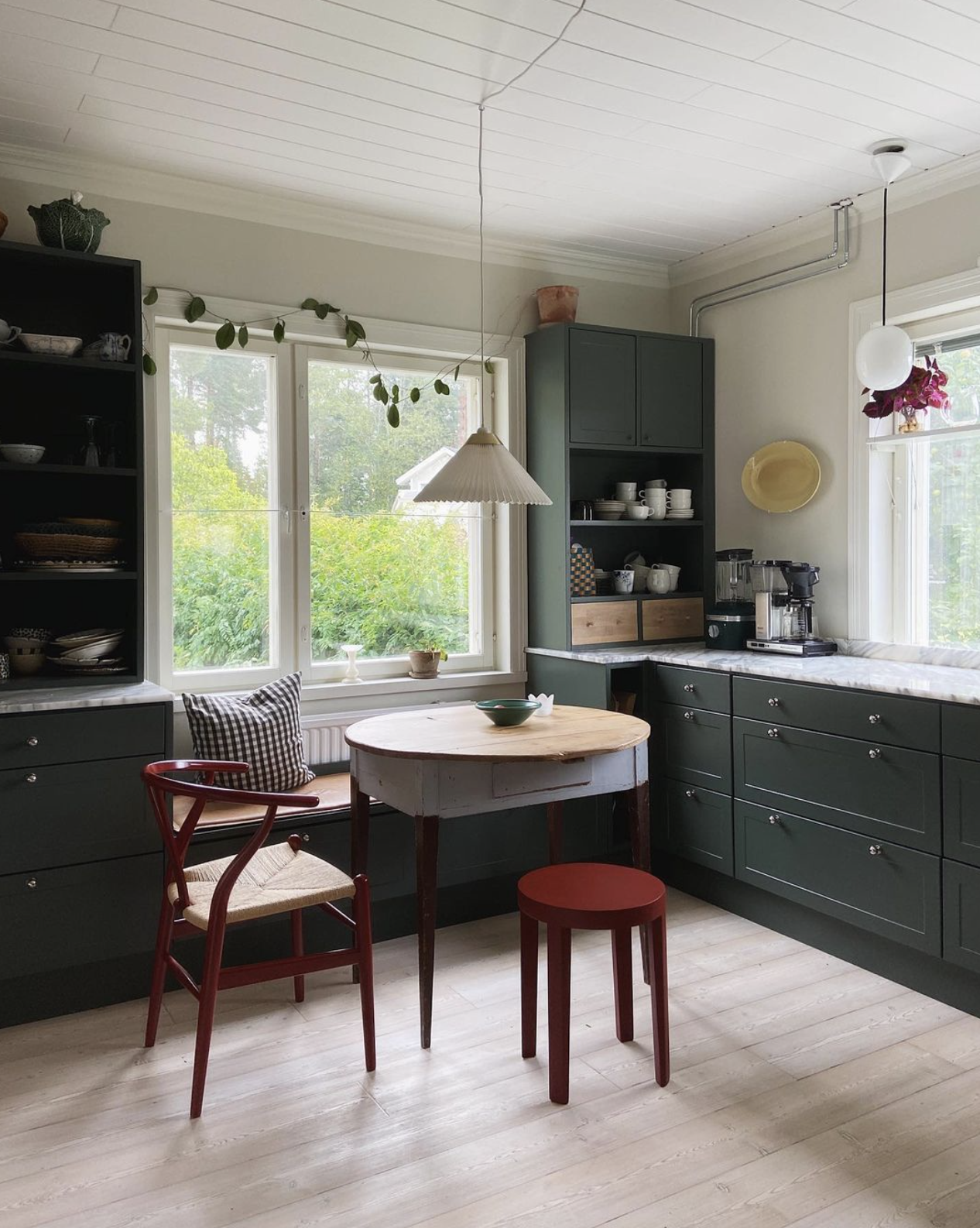
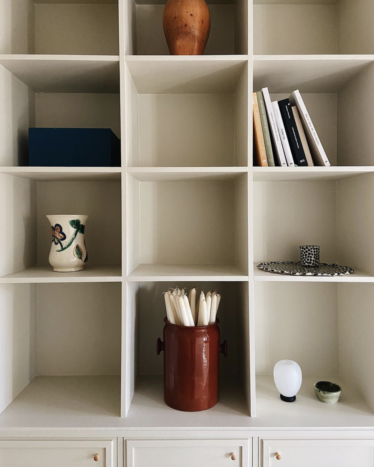
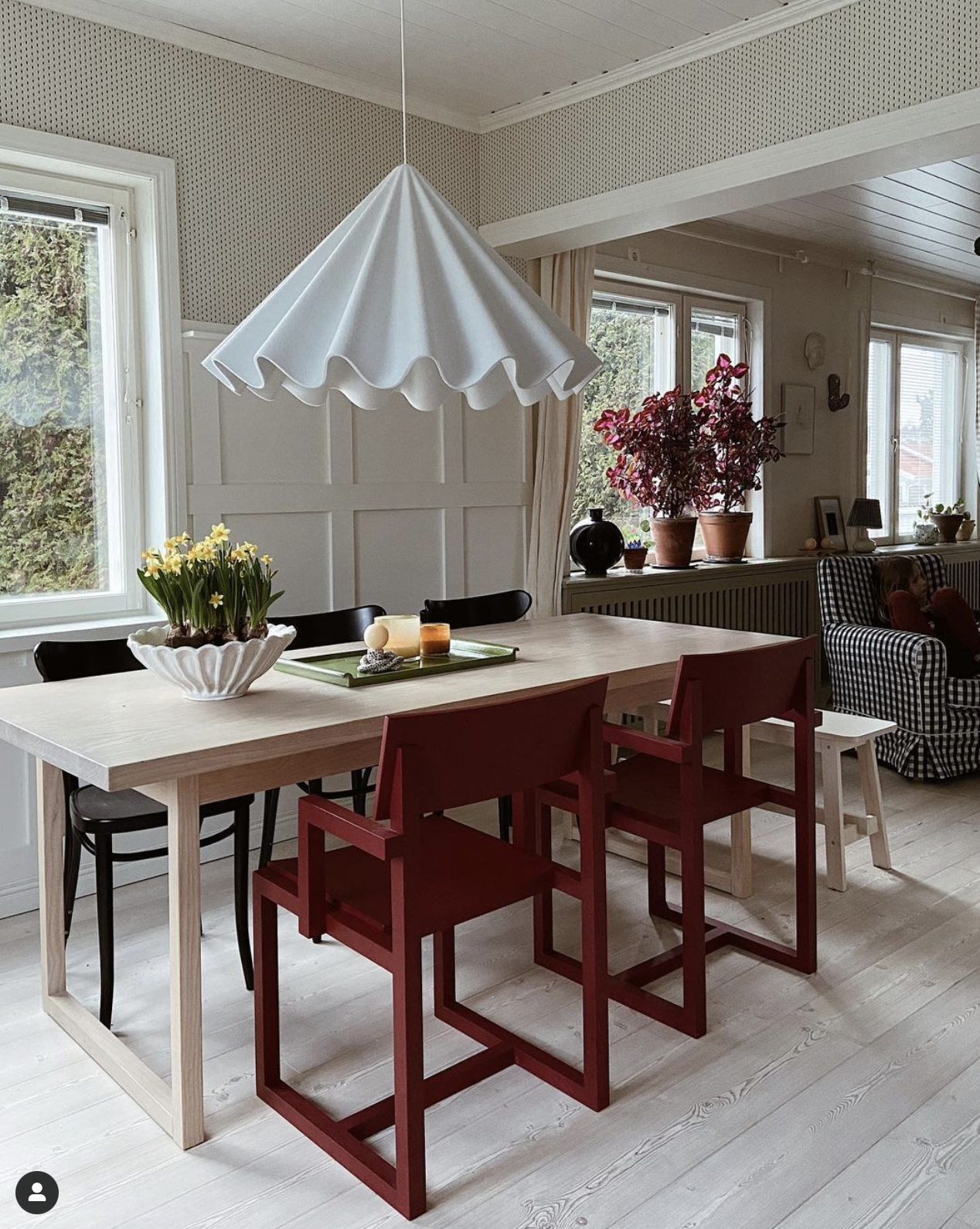
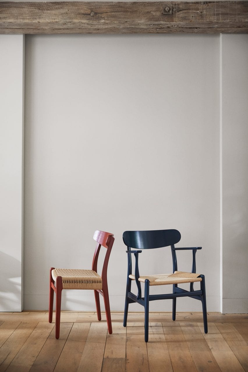
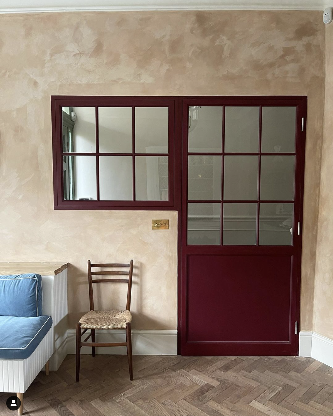
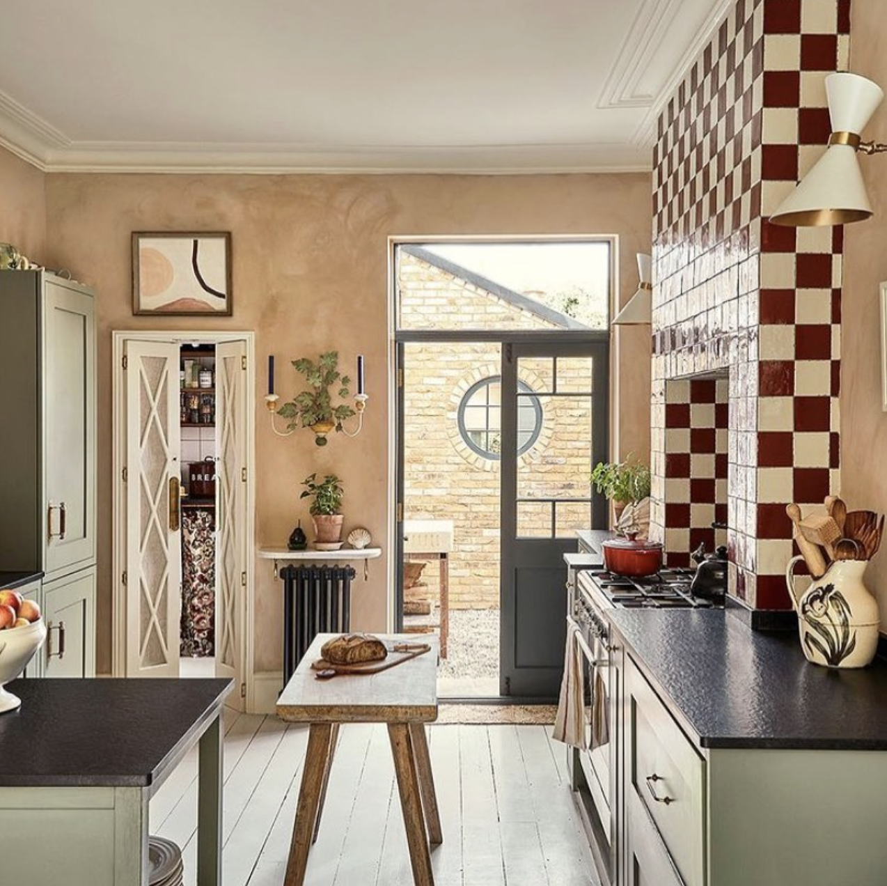
Here are some other beautiful reds that I have spotted for some inspiration for adding these colours to your home…
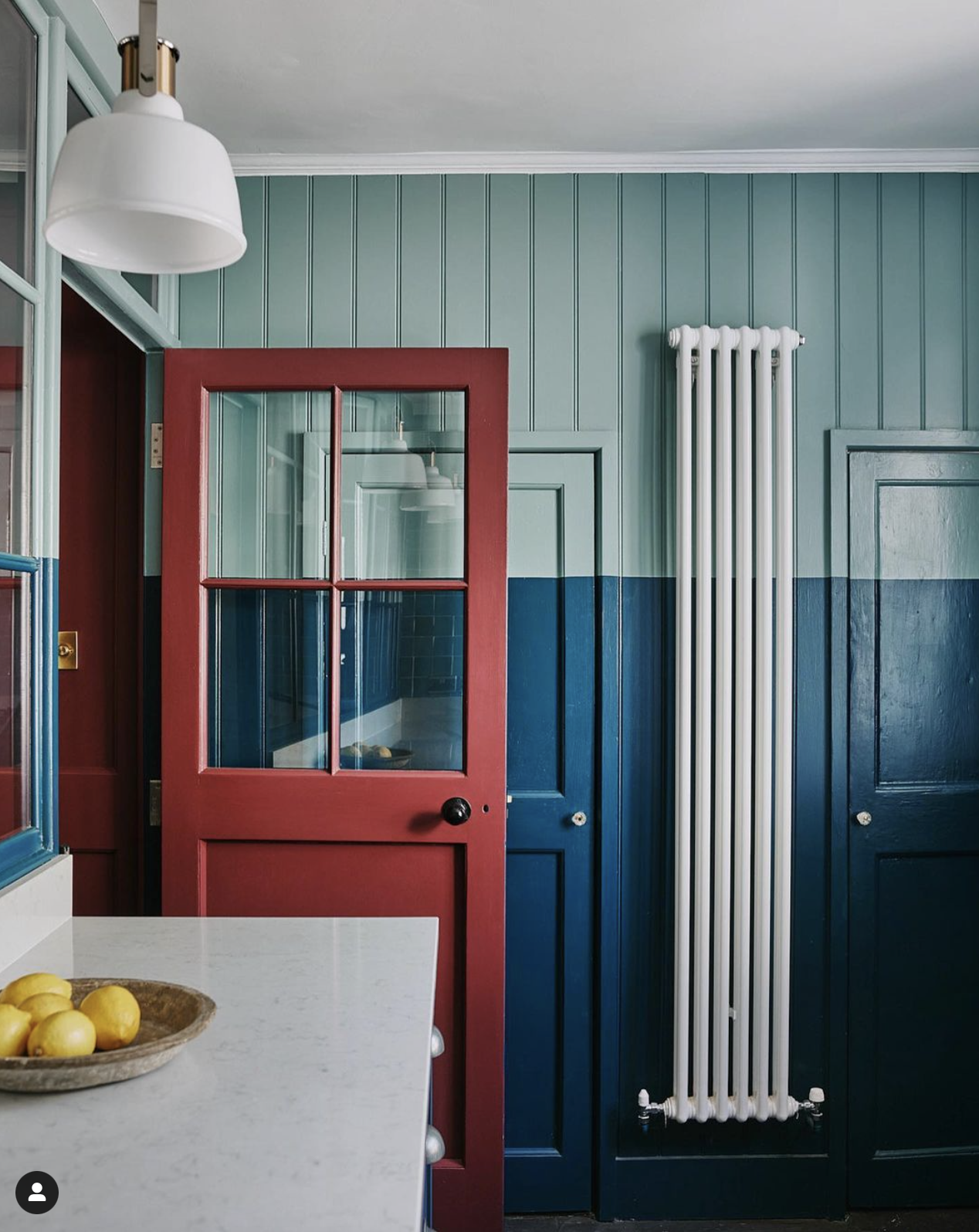
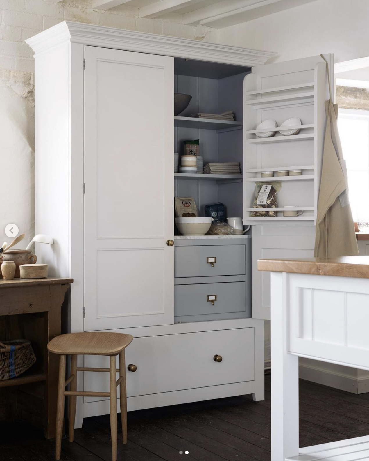
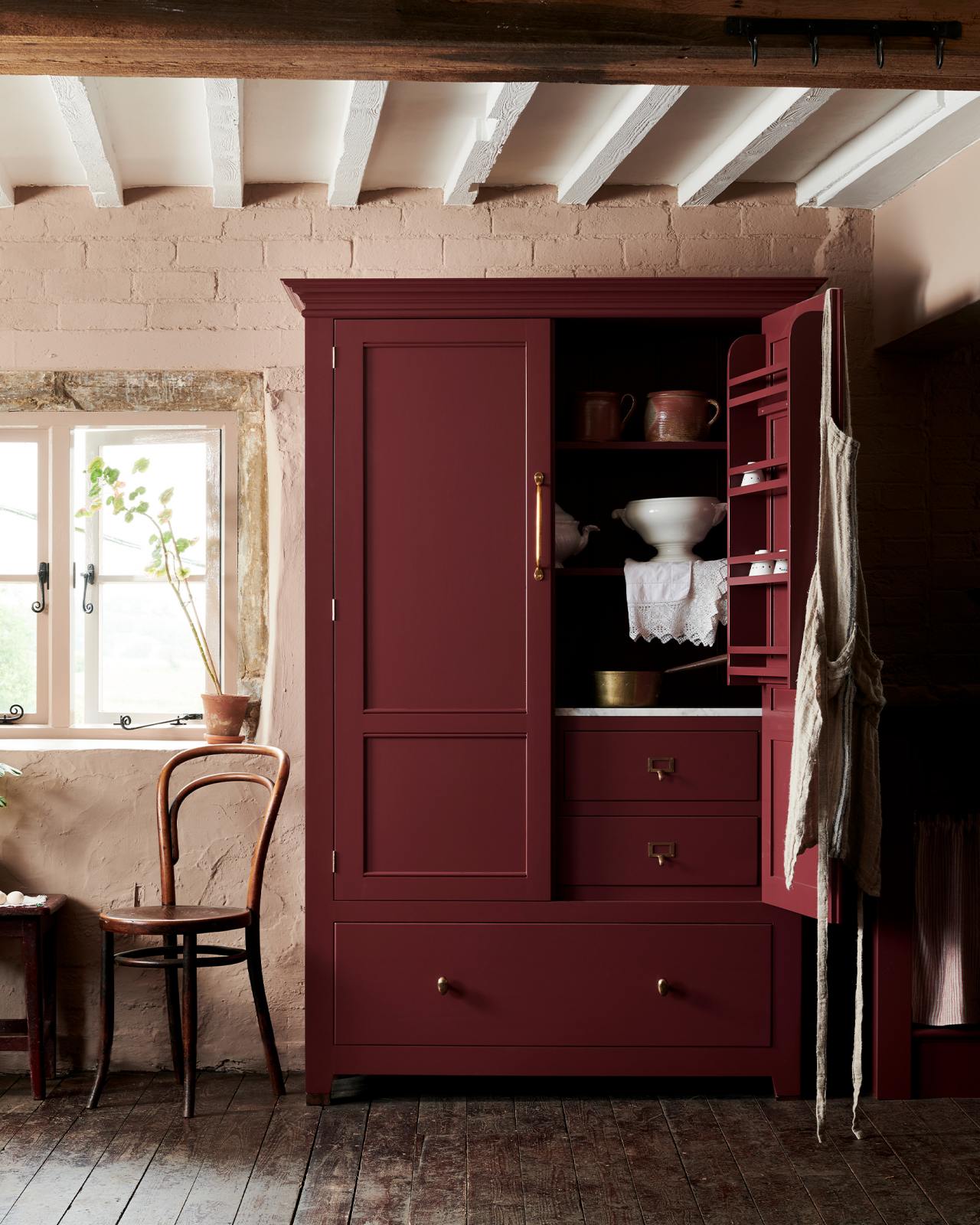
Before I go I just wanted to come back to deVOL’s Refectory Red that I have chosen for the inside of the front door and show you the difference it makes to this white pantry cupboard…
What do you think of these colours – can you be convinced? I’ll keep you up to date on how I get on with the front door!
Katy x